"LSD backgrounds"


Some colorful backgrounds.
Author unknown.
1 AI : 800 KB

Download

"Tattoo set 3"


And another set of vector Tattoos. Enjoy.
Authors unknown. Only for personal use.
1 AI : 2,2 MB

Download

"Traffic signs and symbols Part 2"


Second part of vectorized traffic signs.
Author unknown. Only for personal use.
1 AI : 1,4 MB

Download

"Disco ball"


Incredible vector disco ball.
Author unknown. Only for personal use.
1 AI : 1,9 MB

Download

"Russian ornaments"


Some beautiful old russian ornaments.
Author unknown. Only for personal use.
1 AI : 4 MB

Download

Dragon Leg


Chinese Dragon Graphic.

This art isn't a recent project. I actually created it a little over four years ago for Body Glove Asia. They originally wanted me to develop four different designs to be used on a product called "SnowSliders". (Think styrofoam board with shrink wrap graphics)


"Snowslider" for Body Glove Asia.

The creative process to get this first design in the bag proved to be so painful I bowed out instead of enduring three times more. This isn't the norm, most often even with trouble clients I hang in there and at least push it through and than never choose to work with them again moving forward. But communication was so poor on their part I reached critical mass quickly.

It happens.


Dragon Leg Tattoo.

A year or so after that project I was contacted by a designer who asked if he could use my dragon art and have it tattooed on his leg. Since I retained the rights to the artwork I said sure and we worked out a minimal fee and I sent him the source file.

Almost another year passed and I was at the HOW Design Conference in Atlanta Georgia doing a book signing for my texture book "Crumble.Crackle.Burn" when a guy walked up to the table and introduced himself. I didn't recognize his name (I suck at remembering names) and he swung his leg around and pointed at his calf muscle.

It was Rich, the designer who got my dragon art tattooed on his leg. He's also a very talented Creative Director for the Scripps Networks and we've been able to work on several fun projects together over the past few years.

Well it's been nearly two years since that book signing and guess who emails me a picture of his dragon leg? Hence why I'm posting this now.

It's cool making creative connections like this. Walking portfolios FTW!


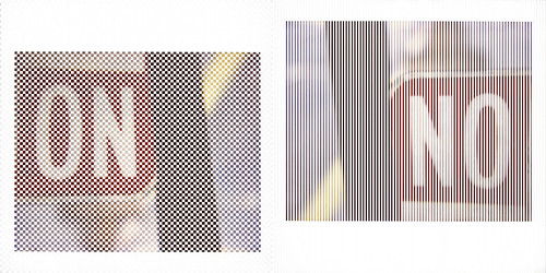
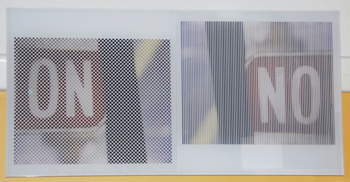
50/50


"50/50 on & not on / no & not no
(ode to Tauba Auerbach)," 2009

my donation to the lab's 25th anniversary auction


11.5" x 23" facemounted to plexi.

New FBI Case Files


FBI: New case files posted.

In August of 2008 the Federal Bureau of Illustration was launched.

The FBI is a full-service artistic crime unit headquartered in the Pacific Northwest, with field offices across the country and around the globe.

Our creative investigations seek to solve illustrative design crime. We thoroughly investigate visual felonies, isolate suspects and arrest the guilty solutions. What ever the case the FBI is here to protect and serve quality illustration and prevent design atrocities.

New Case Files Posted
Brand Larceny: Lorain County Visitors Bureau
Brand Larceny: Mardi Gras World
Brand Larceny: Divina Properties
Rogue Character: Rockhurst High School


View and read the latest FBI case files here.


Beautiful Vectors


Asian Beauty.

View larger preview of art here.

I've been wanting to illustrate a person in this specific style for a while now. I wasn't sure who I should illustrate, but then while I was watching an episode of "Star Trek Enterprise" the character Hoshi solidified it for me. I wanted to illustrate a Japanese women. (Someone pointed out to me that the actress that plays Hoshi isn't Japanese, she's Korean. So there you go.)


Illustration Detail.

Being a former diehard FreeHand user of 15 years I have to say that I simply could not have pulled this off in that application at all. Not even close. The blend modes and transparency alone within Ai is just so awesome and fun to use.


"Beautiful" tiled pattern design.

View larger preview of pattern art here.

In the past year I've designed well over a 100 illustrative patterns for my new book on vector tiled patterns called "Drip.Dot.Swirl" due out in May.

For this project I wanted the background to have a nice authentic Japanese type pattern you might find on a Kosode.

It's not a traditional Japanese pattern, but I was inspired by many of the historical designs I researched. It's a west meets east approach if you will.

In regards to the Kanji characters in this artwork it translates to "Beautiful."

This project was a lot of fun, I'm happy with the results and I look forward to doing more artwork in this style soon.


This Old Art


Rockhurst High School Mascot.

It's been a few years since I've landed a mascot design for a school. I did two other bird themed mascots for another high school in Arizona. And I also did a scorpion mascot for another high school in Arizona as well.

Unlike the past mascots which I created from scratch this mascot had a history with the school. They didn't want a completely new approach they just wanted the existing art re-created with my flair.

I call this type of project a "Creative Re-Model." The foundation and framework don't really need to be torn down it just needs to be reinforced and built upon with a better artistic structure. So I guess that makes me Norm Abram and I welcome you to my blog edition of "This Old Art."

The Creative Stages

1. A Fowl piece of mascot art. The art they provided as their existing mascot looked like a 20th generation photocopy.

2. Too adult and serious. My first rough sketch pushed it towards a more sophisticated NFL type look with the character. The client requested a younger and hipper hawk.

3. Youthful, but too aggressive. I looked at hawk photo reference and that was my problem, young hawks don't have smooth head feathers. So I re-worked the head and showed his teeth. (I know hawks don't have teeth) The client thought it was the right age now just too aggressive.

4. Youthful, confident and strong. The client was happy and approved the art for final build.

5. Drawing out shading details. With final approval I build out my vector art. One edit I did do was to shorten his beak a bit. I then printed it out and drew in my shading detail. Using this as my guide I then built it in vector form.

6. New high school mascot art. Final art delivered to agency.


Come to think about it I'd love to re-design my old high schools mascot art. We were the "Timberline Trail Blazers" and our mascot was a poorly rendered lumberjack. I think I need to make a cold call this week.


"Metro map of Rio"


The Rio metro map.
Author unknown. Only for personal use.
1 AI : 1 MB

Download

"Design elements"


Set of some vector design elements.
Author unknown. Only for personal use.
1 AI : 1,6 MB

Download

"Tattoo set 2"


And another set of some nice vector tattoos. Enjoy.
Authors unknown. Only for personal use.
1 AI : 1,9 MB

Download

"Traffic signs and symbols Part 1"


First part of vectorized traffic signs and symbols.
Author unknown. Only for personal use.
1 AI : 200 KB

Download

How I Build Vectors


Video Tutorial "Vector Build Methods 1"

I have posted my first video tutorial at www.IllustrationClass.com

If you've enjoyed my other tutorials which document the systematic process I use to create my art, then click on over and watch me demonstrate it for you via video.

I hope you enjoy them and find them helpful.


Brand Face


Brand Face is moody. (Click image to view larger)

This morning I was thinking about all the recent brand designs that have caused a lot of discussion in the design community. The majority opinion it would seem of late is that many larger re-brands are being poorly executed. (Pardon the pun)

As I continued to think about this an idea struck me, what if you formed a face based on some of the best known brands today and what emotion would that face have at this time in our industry? With that in mind I had some fun and the above is the result.

Nose: I love this packaging BTW. I just used it because it makes a good "Red" nose to represent a cold. The juxtaposition with Pepsi is a bonus.

Eyes: The new Pepsi mark and the Xerox marble logo. Cross eyed if you will.

Eye Brows: Nike styled furrowed brow.

Tear: Kraft Foods brand frill.

Mouth: A downcast Amazon.com smile.

Thought: The new "Jack" in the Box isn't so nibble.

Beverage: Tropicana is tasting a bit sour of late.


Cheer up Brand Face! You'll eventually feel better. Be thankful you haven't caught a case of the Google. The acne of branding.