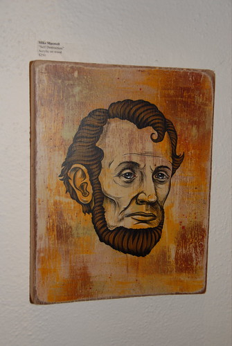
we went to banksy's show at an la warehouse over the weekend. i have not seen much of banksy's work in person, so this show was a real treat.
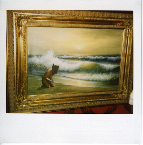
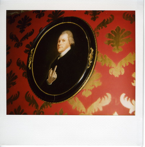
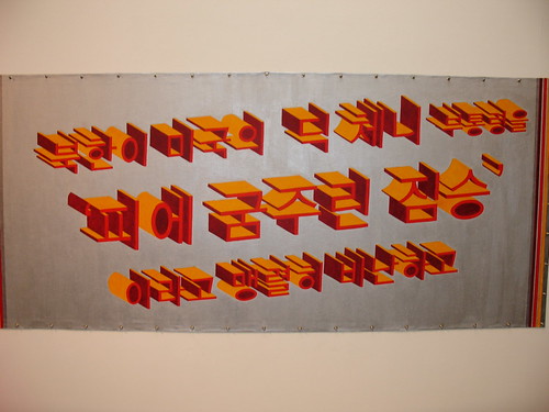
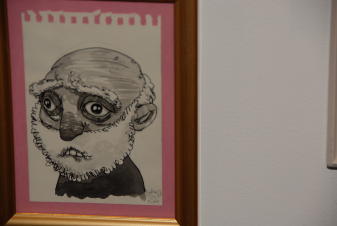
it was nice to see his reworked flea-market paintings in person:
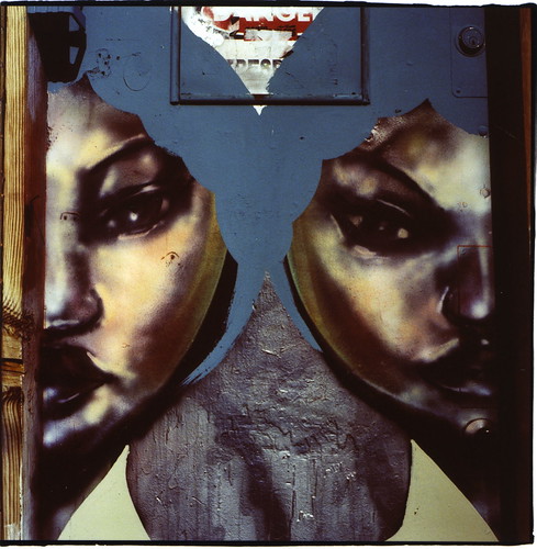
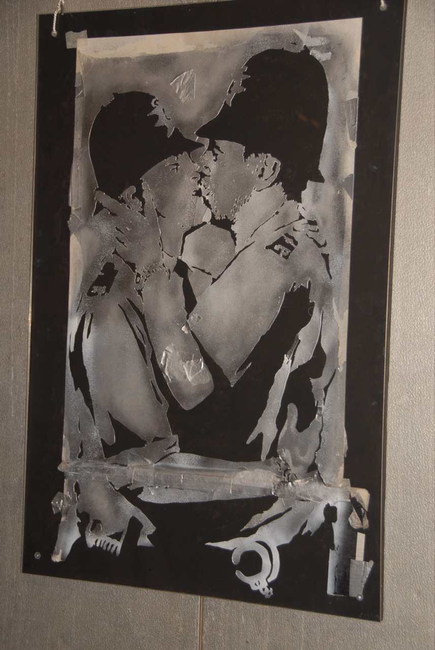
and, the gay cops in the back of the van are hot:

the nyt, ever vigilant, reported that the "how's my bombing" sticker on the back of the van has an 800 number for a navy recruiting office in phoenix. banksy also included the original stencil for the
liplocked cops.
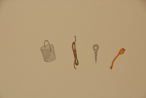
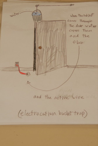
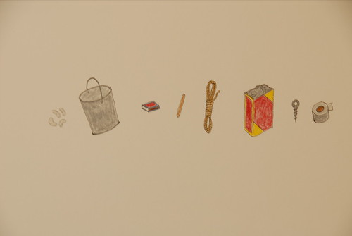
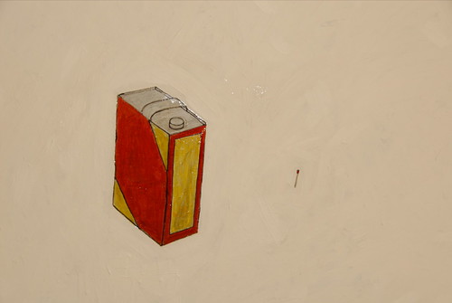
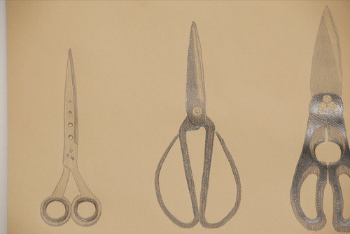
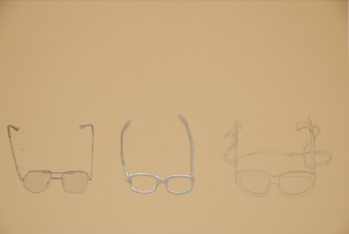
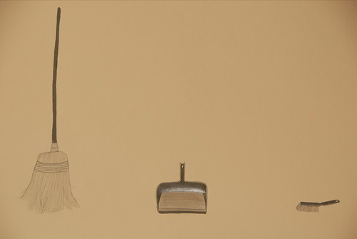
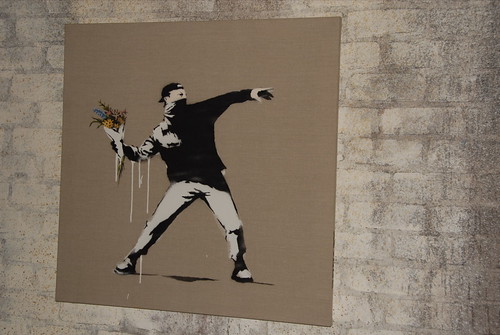
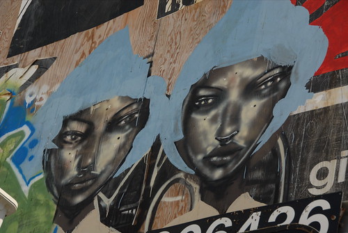
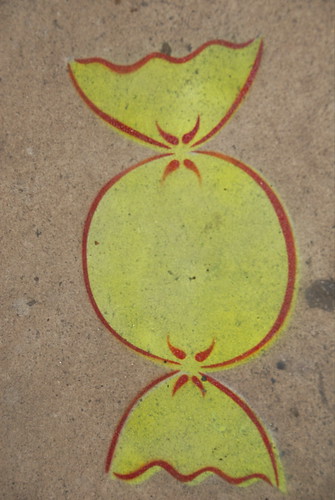
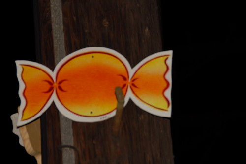
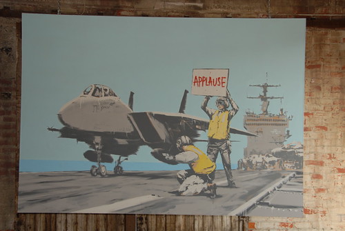
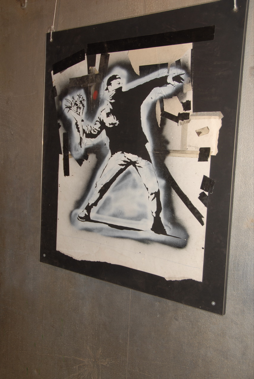
the show included recent street work on canvas:
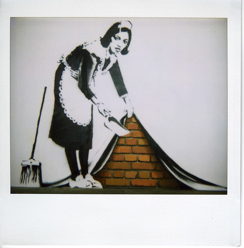
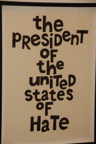
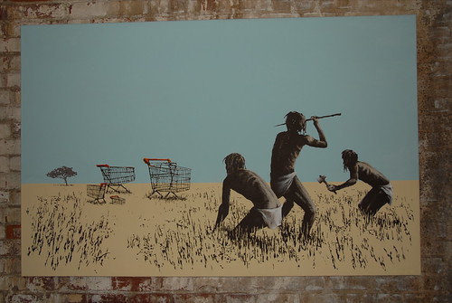
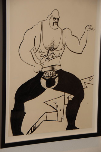
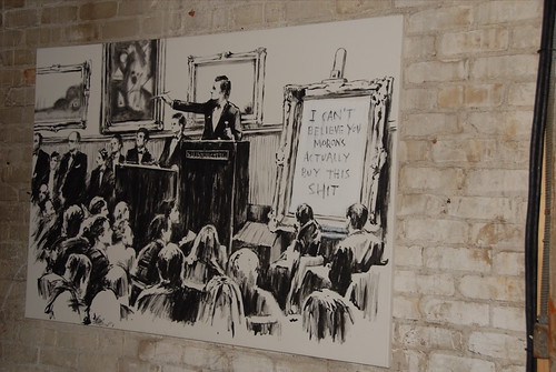
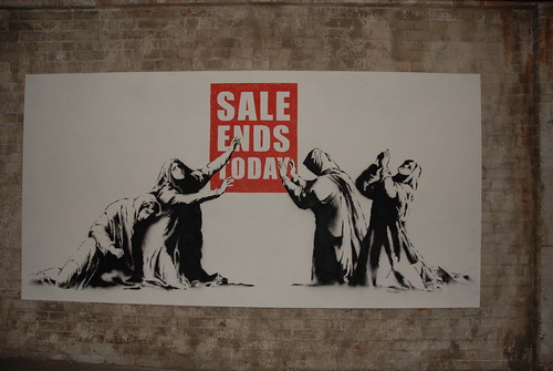
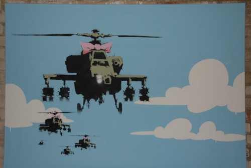
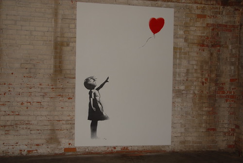
and, many of banksy's greatest hits.
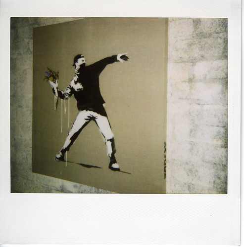
(including the
stencil)
overall, it was a nice show. the setting was large enough to house an elephant and leave sufficient space for the fans to checkout all of the work. they screened a 7 minute film comprised of some of his stunts (ny museum placement of banksy's work, disneyland, paris hilton cds, etc.) and some quick shots of his work in public. i have seen a lot of it on the web but it was nice to see on a big screen and without bandwidth issues. banksy's film crew was also present, interviewing folks about banksy and the work.
i took a nearly complete set of the entire show with my digital camera (not included are the sculptures, elephant, and sketches). view the
slideshow?the mediasomehow i was not invited to banksy's wednesday night preview of his la warehouse show (for the press). once again, banksy worked the media. google news identifies a number of news sources that covered the event, from the usa, uk, canada, australia, china. the show made the
nyt and even
al jazeera.
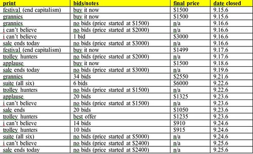
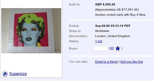
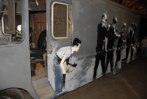
collector's notesthe original work was priced from around $25,000 for a very small piece to $500,000 for a
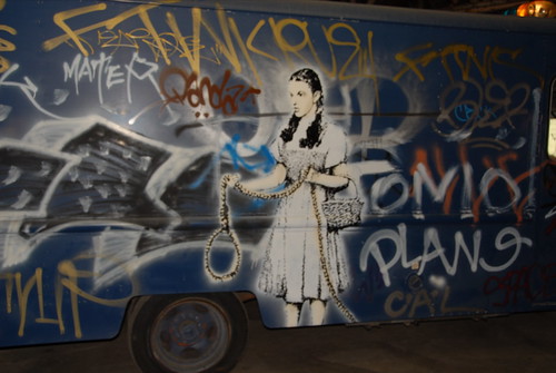
truck with
multiple stencils (also including the kissing cops above). most of the original paintings were priced between $100,000 and $300,000. we heard that most of the work sold out at banksy's thursday night preview for la's a-list.
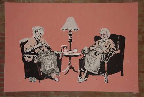
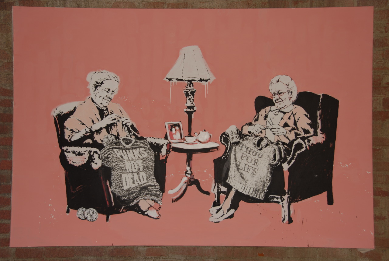
they also had prints of some of the work in the show, including the lovely painting of knitting grandmothers.
ironically, the
nyt posited that sales of prints at $500 each "would seem to go against Banksy’s rebel image." they could have made a stronger point by identifying the sales of original work to hollywood's elite for $100,000 to $300,000 a pop.
the response in the nyt from banksy's "spokesman" (i still want that job) was “yes, there probably is some contradiction....it depends on what he does with the money, right? maybe he makes more art. maybe he’s getting more ambitious.” banksy's take in the la weekly
interview was "when someone buys my work, they know that they’re indirectly funding street damage, and you’d be surprised who’s cool with that."
my view is that it might as well be banksy who makes that kind of return on his paintings. banksy is the godfather of stencil painting. he helped to create the genre within street art. his work is beautifully rendered. he inspires plenty of kids working in the streets. and now, he is helping to bring stencil work - and other street art - to the upper echelon of the fine art world. banksy is the top of his field. if anyone should command that price for a painting - and many do - i am happy to see that it is banksy getting up. i hope he keeps his head. so far, so good.
and, i recognize that at some point the price of art is more a fact of the status of the artist than the art itself. the brand name of the artist places the value of the work into a different category. banksy is now an art world superstar - commanding sums more akin to the movie stars who purchase his work. banksy is certainly not contending that his prices are somehow related to his labor. on the contrary, he seems to tease, noting in the la weekly interview that "some of the paintings have taken literally days to make." his spokesman reiterated the point to the nyt, noting that "some of them took literally hours to paint."
nevertheless, these works were probably a good buy. right now, all indications are that his career is taking off, not peaking. the work in the show was very strong. there is a lot of demand for his work and that will only grow as his celebrity continues. banksy arguably has a spot in the art history books as the grandfather of stencil work and the first street art celebrity of the 21st century. at that point, it seems, big works for $300,000 may be a bargain. will be interesting to see where banksy goes from here. whether he crosses over to the big contemporary art fairs (banksy at art basel?), the venice or whitney biennials, big museum shows?
the prints are also likely a good value. i heard the prints were edition of 100, only available at the show. from looking at ebay, it looks like the prints were edition of 500 but only 100 were released at the show. they need to work out these kinks - and present a clear message to the public - or they are going to get sued.
nevertheless, these same prints could be found, within 24 hours, on ebay with sellers seeking $1500-$3000 per print. the market will ultimately tell but having followed the pricing of banksy's prints to date, the asking price for the new prints is not unreasonable. however, it does feel a bit like the other economic bubbles in the market. time will tell.
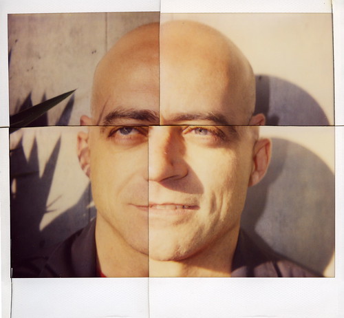
given that banksy's original work is out of my range, i took a series of polaroids (many shown above). these will allow me to create my own banksy installation at home. view the
polaroids?


