Nincompoop


Custom type for HGTV.

Over the past six years I've slowly been working on a new font design I call "Nincompoop." When ever I get a project that comes in and the style of my type works with it, I'll create new letter forms and re-use existing characters to create my art and expand my alphabet for the font at the same time.

Such was the case with this project for Scripps Network and HGTV.


Custom type for HGTV.

Prior to the dawn of OSX I use to design fonts more often. I use to work at a design firm locally where I was responsible for designing five fonts all of which are still available through T26.com. Of course my former employer owns these, but you can check each one out via the links below.

- Beat Street
- Frazzle
- Hunky Dory (Orig. name: "Scorn" AD changed it. Lame.)
- Lollygag
- Squidly (Orig. name: "Biomorphic" AD changed it. Lame.)

Over the years I've spotted my type in various places. Some usages last a few seconds, some are amusing, and others are just laughable.

When I designed the fonts above Postscript ruled the roost. But since then the Open Type format has brought a new standard for all future fonts and rightly so.


Custom type for HGTV.

I simply don't have the time to learn a whole new software application like Font Lab Studio so I'd rather focus on the creation of the letter forms and just hire out the production end. For that I'm willing to split the profits for any font developer wanting to team up. So if you know how to produce a font or know someone who does please introduce me to them.


"Nincompoop" sample.

Since Open Type allows for a lot of customization I'd create multiple variations on letterforms, ding bats, characters etc. in the final form of "Nincompoop."

But for right now I just have an Ai file I copy/paste from to create what I need.


Blend it!

Drawing with Uncle Pat


My Uncle Pat scored some drawing supplies for Christmas.

A few posts back I introduced you to my Uncle Pat. He shared a drawing he had done and many of you asked Pat to draw some more pictures over Christmas.

He seemed to really enjoy drawing so our family got him some art supplies for Christmas. The last few days I sat with Pat as he drew pictures and have posted them below along with a couple videos. I hope you enjoy.

Uncle Pat Talks about his artwork.


A scary Bear, a Spear, and a Crow.

When Pat draws he gets really into it. His face is just inches away from the paper and he doesn't come up until he's done. I loved how he did the feathers in the crow art.


Pats friend the Cat.

The only thing we suggested Pat draw was the Moose and me shown below. Everything else he just decided to do himself. I find it interesting that all of them with exception of the Snowman were an animal. He likes animals apparently?


A Chick.

I thought he did a great job on this baby Chicken. The color and detail came out awesome!


An Alien Moose.

Pats art reminds me of something Stefan Bucher might have animated.


The playful Snowman.

In the midst of drawing all his animals, Pat quickly drew out this snowman too.


The green Grouper.

I liked the simplicity of this art and the shape of it's mouth.

Uncle Pat Draws Me.


Pats drawing of me.

My youngest sister Amy told Pat to draw me and this was the end result.

I just wanted to thank everyone for commenting on the previous post I did about my uncle Pat. We were able to show Pat the blog post and read through all the comments for him and he enjoyed it a lot. We had fun drawing together and I thank God for him, he has a very gentle spirit and I think his art rocks!


Blend it!

The Clone Wars

This past year has had it's ups and it's downs. With the economy tanking, every creative business has been effected in one way or another and mine was no exception.

But the most disturbing trends within our industry in my opinion are two fold:
1. The continued growth of the "Creative Industrial Complex" via pre-fab design, which I touched on in an earlier post this year. I'll have more to say about this specific topic in an upcoming post on my blog.

2. The exponential growth in copyright infringement. I've had a total of "62" individual cases (That I'm aware of) where designers, marketing firms, design studios, ad agencies, stock companies, and other businesses used my artwork without paying for it or seeking permission to use it.

Unfortunately I don't see this problem going away. More and more art schools are focusing on the tools rather than the creative process that facilitates original and unique ideas. Thus they are producing the next generation of copyright infringers who ironically in many cases are the same mindless drones who facilitate the degrading of our industry by pimping their ware to industrial hacks like CrowdSpring.com.

But I digress.


Google Image Search.

Showcasing my artwork online is a double edged sword. For a creative hired gun like myself you have to promote or perish. Marketing my services is a must, but it also opens me up to being exploited by unscrupulous design hacks who have no problem googling for their creative solutions.

Most of the cases I was able to handle myself by sending out a copyright infringement letter. Some are just over zealous tattoo lovers who never bothered to ask permission but still feel obligated to email me a picture so I can share in their flattering copyright infringement. This over time has spawned a rogues gallery of what I like to call "Walking Portfolios."


The Damage
I've spent roughly "73" hours responding to the "62" individuals cases. I don't charge by the hour but if I did I figured the amount of time I've invested this year alone is roughly $8,500.

Three of the cases I had to hire a copyright lawyer to deal with them. I settled two of those amicably. The third case is currently ongoing and is represented by the video below.


Chronological list of all the 2009 infringers.

- Photobucket.com User Tribal Tattoo Face Art
- Zazzle.com User Bonehead Skull Artwork
- MySpace.com User Tribal Tattoo Face Art
- Beerorkid.com Trashing Abe Art
- Deviantart.com User Tribal Tattoo Face Art
- Motattoo.com Tribal Tattoo Face Art
- Olloo.com Tribal Tattoo Face Art
- Alaskaslist.com Polar Bear Logo Art
- Deviantart.com User Tribal Tattoo Face Art
- SideHatchEntertainment.com Tickles the Evil Clown
- Chrinodesign.com Billy Mays Artwork
- VolcanoVistaHawks.com Black Hawk Artwork
- Community.mediacorp.com.sg Tickles the Evil Clown
- Flickr.com User White Tiger Art
- Flickr.com User Tribal Bat Tattoo
- Logotypes101.com Fire Giant Art
- ShutterStock.com User / Serbia Black Hawk Artwork
- Lacrosse.schigas.com Black Hawk Artwork
- Deviantart.com User Tribal Bat Tattoo
- IMVU.com User Tribal Bat Tattoo
- 895thehawk.com Black Hawk Artwork
- Dummidumbwit.wordpress.com Billy Mays Artwork
- Unconfirmedsources.com Billy Mays Artwork
- Emptees.com Tribal Bat Tattoo
- Mundozenn.com / Brazil Tribal Tattoo Face Art
- Deviantart.com User Tribal Bat Tattoo
- LAtimes.com Billy Mays Artwork
- SeemyButton.com Billy Mays Artwork
- Consumerist.com Billy Mays Artwork
- Brownsville Early College HS Scorpion Mascot Artwork
- EveryTattoo.com Tribal Tattoo Face Art
- Tao-Of-Tattoos.com Tribal Bat Tattoo
- Twitter.com User Self Portrait Illustration
- Discrim Athletic Tees Black Hawk Artwork
- Zazzle.com User Billy Mays Artwork
- Vyzion360.com Tribal Tattoo Lion
- Flickr.com User Tribal Tattoo Face Art
- Junklist.eu Two Headed Eagle Art
- JohnHaller.com Billy Mays Artwork
- Deviantart.com User Tribal Bat Tattoo
- Flickr.com User Tribal Bat Tattoo
- Picsquare.com Tiger Art
- Deviantart.com User Alien Skull Art
- Flickr.com User Tribal Bat Tattoo
- Skreened.com Billy Mays Artwork
- Gun Shop, Tacoma Espy Graphic Bird
- Photobucket.com User Black Hawk Artwork
- KosherHam.com Billy Mays Artwork
- InkedMedia.com Tribal Tattoo Skull
- MindSpark.com Billy Mays Artwork
- VectorStock.com User Doodle Fish Artwork
- case-mate.com Tribal Tattoo Face Art
- designbyhumans.com Tribal Tattoo Face Art
- (US Army) wood.army.mil White Tiger Art
- Zazzle.com User Owl Artwork
- WAWK.com Black Hawk Artwork
- Classiccitysigns.com Black Hawk Artwork
- Embroiderydesigns.com Alien Skull Art
- Flickr.com User Tribal Tattoo Face Art
- Houseofgrafix.net Billy Mays Artwork
- Uthstuph.com Security Shield Logo


"Unique" and colorful tribal pattern.

I don't enjoy getting my work ripped off and it frankly pisses me off when I have to waste my time dealing with it when it happens. That said I still try not to be a jerk with the people I'm forced to confront. I tend to give them the benefit of the doubt and try to treat the situation in a reasonable manner. If the infringer responds reasonably and works with me to resolve the matter than I can avoid taking it to next level legally.

But that isn't the case with case-mate. (Pardon the pun) I gave them three months to respond to my reasonable request regarding their infringement and use of my tribal face tattoo art on one of their products to no avail.

So as this year ends a copyright infringement lawsuit begins.

Follow Up: I've settled with case-mate. It took four months of back and forth but I was able to protect my copyright.


Blend it!

Fa La La La Lifetime - Take III


Original Hand Lettering for "Fa La La La Lifetime."

This now makes the third Christmas in a row that the Lifetime Channel has used my "Fa La La La Lifetime" branding for their holiday promotional efforts.


"Fa La La La Lifetime" bug graphic.

During this season you'll see it as a bug in the lower right hand corner of the screen and it'll also appear in numerous TV spots. (But the ones that look ugly and where their in house people added dimension to the letter forms I had nothing to do with.)


"Fa La La La Lifetime Movie Network"

Lifetime contacted me again this year to create additional custom lettering to augment their current seasonal branding efforts. The image above shows a stacked option and I also created a long horizontal option with everything resting on the same baseline as well.


"Fa La La La LMN" bug graphic.

This shows an abbreviated version I also created that can be used as a bug graphic.


"Fa La La La LMN" alternate bug graphic.

Sometimes when working on projects like this I explore beyond the requested deliverables. So on this project I also provided them with the type nested inside a fun shape as well. Not sure they'll ever use it but I liked it.

TV Promotional Spot - 2009


Blend it!

Robot Love


My Toy Robot Collection.

My fascination with robots started in the summer of 1977 when Star Wars hit the big screen. As I've posted before, robots are one of the top ten themes creative people love.

So when I moved into my new studio a few years back I found a unique shelve design to display all of my robot collectibles.

I've been wanting to use them for a creative project in some way, but never could figure out an appropriate use. That is until I worked on a recent identity project for New Modern Science.


Raw Photograph of Robot.

As I worked on the identity for New Modern Science I realized the robot would make a perfect company mascot. A secondary branding element in essence.

I'm not a professional photographer, but I know enough about photography to get what I need in this case. I set up a nice forced perspective shot against a white background.


Final Photograph of Robot Mascot.

I took my raw image into Photoshop and cleaned up some details, added depth of field fx, and crossed processed the colors so it worked well with the look and feel of the logo mark.


Brand integration.

The robot fits the context of new brand identity well. I even used it on the back of the business card design I created. You can view the whole project on my primary design site here.


Blend it!

Hardy Har Har


Comedy Club Logo Mark.

One of my favorite agencies communication firms in these parts is ReThink Communications. They do some seriously cool work and are a blast to work with on projects too.

I've worked with them in the past to create some fun icons for their client Kolachy Co. The most recent project was a logo mark for the Vancouver Comedy Festival.


Vancouver Comedy Festival Logo.

Design is so much easier when you have a great concept. The CD on this job Jeff Harrison had dialed in on a great concept and we worked together to create what you see above.


Promotional poster designed by Rethink.

I love the promotional posters Rethink designed. Very funny. And the promotional TV spots they created are excellent too. You can watch them here.


Blend it!

My Uncle Pat


My uncle Pat holding his dog drawing.

My uncle Pat is a gentle soul. He's always smiling and will laugh in a heart beat if you say something funny. I love him dearly.

Pat is the younger brother of my mom and he was born mentally handicapped. Pat is 58 years old now and even though his mental capacity is some where in the range of a 7-9 year old, he possesses more common sense than a lot of people I know.

So when I got to hang out with Pat this Thanks giving I handed him a sketch book and a pen and said "Pat, draw a dog." He smiled and started drawing.


Uncle Pats dog drawing.

I had no idea how this was going to turn out? As I watched him draw I found it curious that he seemed to be keeping the drawing symmetrical.

As he was drawing I heard him say softly "I'm not very good am I?" to which I responded "There is no wrong way to draw Pat. You're doing fine."

When he was done he handed the sketchbook back to me and I said "Is this a Martian dog Pat?" We all laughed. My wife said "It kind of looks like a cow." We all laughed again.


Separated at Birth: Ron Perlman and Uncle Pat

That same day I mentioned to Pat that he resembled the actor Ron Perlman. I googled a picture on my iPhone and showed him. I than asked him to pose the same way and told him I'd put it on my blog. He thought that was pretty cool and smiled.


The Cheshire Pat.

Pat's smile is infectious. And we always have fun joking around with him and laughing together. Pat also has a habit of saying "I'm Sorry." for absolutely no reason at all, which has also made us all laugh at times too as you'll see in the below video.

I'll be sharing this post with him at Christmas so take a few minutes and leave my uncle a comment, I know he'll get a kick when I share them with him. Thanks!

Meet Uncle Pat


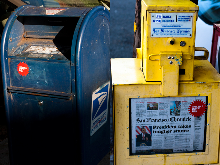
available online for free

the amazing Evan Roth issued an open invitation to participate in his sticker project, with the resulting photos displayed on a loop at the elizabeth foundation for the arts one every day show in new york (which runs through dec. 19, 2009)

billyaoff01sm700.jpg
tonight i emailed my first submission
(kin to my perv: local, organic).

dec. 2, 2009 update
billyaoff23.jpg
two more submissions (they sent me 3 stickers)

sf camerawork 2009 auction

the preview exhibition for sf camerawork's 2009 auction is free and runs nov10-dec4 (info).

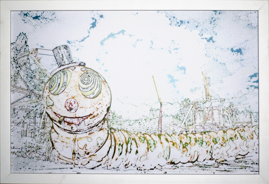
i donated carney (argentina) [archivally framed]
carney (argentina) 2008

"Highlights include: Berenice Abbott, Richard Barnes, Harry Benson, Ellen Carey, Keith Carter, Judy Dater, Robert Dawson, Larry Fink, Ann Hamilton, Lynn Hershman Leeson, Todd Hido, Pirkle Jones, Michael Kenna, Dinh Q. LĂȘ, Michael Light, David Maisel, Robert Mapplethorpe, Richard Misrach, Catherine Opie, J. John Priola, Herb Ritts, Holly Roberts, Edward Steichen, Alfred Stieglitz, Paul Strand, Larry Sultan, Hank Willis Thomas, Catherine Wagner, William Wegman, Edward Weston, Marion Post Wolcott and many others."

the auction is saturday, dec5th, @ 1pm
($30 or free with sf camerawork membership)

Hoodlum Teaser


Cropped "Hoodlum" Editorial Illustration.

I love clients that give me complete creative freedom. The opportunity to explore and create in a direction that is fresh and new even though it wasn't what they had originally requested. Such is the case with this editorial illustration.

To read more about this project and view the un-cropped version of the above illustration visit my primary site.


Illustrative Stunt Double


Striking a pose.

When ever I need reference material for a creative project involving a male figure I call up my friend John Nissen. He was my best man and we've known each other since attending art school. He also has a good stereotypical body type which makes him my go to male model. ;-P

An agency hired me to create some linear illustrations for a campaign pitch. The topic was medical and they requested a few samples to use in their presentation.


Doctor with stethoscope linear illustration.

John is an Art Director at a local firm here in town where I live and does both design and illustration himself so he knows how to strike that perfect pose. In this case a doctor getting ready to listen to your heart via a stethoscope.

These were going to be animated just like the bank spots I've done in the past.


Acting for the sake of art.

Here John is posing as a sick guy looking for a cure online. Does he have H1N1 or is he just a Hypochondriac?


Googling for Rx linear illustration.

Like so much agency work this project died before it ever had a chance to be animated. Easy come, easy go.


From Inspiration to Illustration


"TRI 3Y3 Guy" character illustration.

Like the wind, inspiration can hit you at any moment from any direction, so I like to pay attention to the prevailing creative winds letting my imagination set sail.

Such was the case when I recently watched the movie Fargo. I hadn't watched since it's premiere back in 1996. The moment of inspiration came from an unlikely source, the forehead of actor Steve Buscemi.


Details of illustration.

So as I watched the movie I started drawing, a head start on an illustration project if you will. (Pardon the pun) The below video will take your through the entire chain of creative events.


"TRI 3Y3 Guy" t-shirt design.

Looking for that perfect give for your beloved mother in law? Look no further, nothing says "I love you!" more than a t-shirt of the "TRI 3Y3 Guy."


"TRI 3Y3 Guy" art print.

"TRI 3Y3 Guy" is available in three formats:
- Download PDF Art Print
- Download Wallpaper Files
- View / Order T-shirt

From Inspiration to Illustration


Brewing Design

I just posted a new project at my primary design site regarding a coffee label design I did for Rahzo.com. I had shown this label to twitter users a while back after I got shipped some printed samples and was asked if I'd deconstruct how I went about creating it.

Well that is what this blog post is all about. So grab a cup of coffee and enjoy the post.


Source Photo: Paris, France.

1. Source Photo
Because I named the roast "Noir French Blend" it goes without saying it needs to have a French flair to the approach. I sourced out this picture which has the Eiffel Tower in the background.

I also picked this image because the contrast was perfect for how I planned on using it too.


Compositing images via Photoshop.

2. Distorting Reality
I wanted the the Eiffel Tower to be a focal point in my composition so if reality doesn't work you do what every fashion magazine does and manipulate reality so it looks better than real.


Converting photo to a halftone.

3. Halftone FX
I converted the photo to a halftone. In a nutshell: Convert color photo to greyscale, convert to halftone by going to the menu image/mode/bitmap. From there you'll have to experiment in order to determine what size of halftone works best for you, it isn't a one size fits all process. Once you have the size nailed down you have to convert back from bitmap to greyscale then copy/paste it back into your PSD file.

If you're still scratching your head after reading the above try this link it might help you? Or my big dot tutorial might also explain this process better?


Halftoned photo integrated into layout.

4. Halftone Integrated
I nest the halftoned photo into my over all layout. Mind you this is screen res so it doesn't do the halftone justice. Make sure to view the larger image at the end of this post to see how the halftones enhance the look and feel of the design.


European Beauty.

5. Romance
I wanted drama in my design. It's Paris so it needed some beautiful romance so I sourced out this photo. Her eyes were captivating and that was what I was after.


Romantic dot gain.

6. Larger Halftone FX
Once again I used the same halftone effect, just a larger size and composited the romantic gaze into my design.

A lot of what I do when I use Photoshop is experimentation. Playing with transparency, blend modes and arrangement of content and via layers to achieve the look and feel I'm after.


Laying a graphic foundation.

7. Graphic Foundation
This historical ornament and banner dangler will serve as the foundation for critical content like type and iconography as you'll see in the following images.


...Like a big pizza pie that's moire.

8. Creating a Moire Effect
The design over all felt too stark to me. I wanted to blend it all together more. So I just opened another color stock photo (Any will work) gaussian blurred it, went to filter/Pixelate/Color Halftone, converted it to greyscale, copy/pasted it back into my PSD file, messed with transparency and blend modes and there you have it.


...You're in love.

9. Moire Effect Applied
Compare this image to step 7.


Adding more character.

10. Texurizing
To add more depth and interest I used a variety of surface textures from my "Crumble.Crackle.Burn" book.


Interesting diagram art.

11. Diagram Illustration
I wanted culture appropriate imagery to collage my design with so I did some research and found this great retro diagram illustration of a Vespa scooter.


The Vespa has been parked.

12. Diagram Illustration Integrated
I'm building my design layer by layer taking the various graphic elements and collaging them together. After all that is essentially what graphic design means.


Information added to the layout.

13. Typography & Iconography
It goes without saying that the type you choose need to work for the specific genre you are designing for. This design uses just two typefaces and I've added an iconic graphic of a coffee plant to lock up the design motif.

I also left room so we could work in Rahzo's logo stamp as well.


The label diecut.

14. Diecut
On this project we had the luxury of doing a custom diecut so I created this unique shape to frame my design. Of course I knew I was doing this from the beginning so I kept that in mind as I collaged my graphic content too so as not to loose anything when it was trimmed.


Piping hot design ready to pour.

15. Final Product
The final labels came out great and the product is now available.

Click here to view a larger image of the final label design.

If you'd like to deconstruct this project further just download the "Brewing Design Pack" below which contains a print resolution (150 dpi) layered PSD file. (CS4 file but will open in CS3 or CS2) You'll be able to click through the layers and see exactly how everything was set up.

- Download "Brewing Design Pack" (5 MB)