Weenies Don't Get Tattoos.


'Skull Tattoo Art'

A few months ago I participated in a collaborative art zine called 'I Want Your Skull!' The developer of that project has decided to do a second installment called 'I Want Your Skull 2' and I created this art for my contribution. The zine is in glorious black and white which I've created a version for that publication, but for this post I had fun with some color.


'Color Explorations'

Skulls remember are number '4' on my 'Top Ten Favorite Themes' list from a previous post I made, so as always it was a no-brainer topic to have fun with.

I like creating art I can use for multiple purposes so this dove tailed perfect with the digital illustration class I teach. This past week I assigned a 'Tattoo Illustration' to my students so I documented my process on this project and will share that with them and post the tutorial at www.IllustrationClass.com


'In Context Mockup'

People have asked me why I don't get a tattoo myself. Well I am kind of a weenie and don't like pain for one thing. Another reason is I can't commit to the art for a lifetime. I'd get sick of it after a month and then regret permanently applying it to my body for the rest of my life. Temporary tattoo's however have come along way and I might give that a try. But then I'd feel like a total poser so I may just stick with drawing them and call it good. ;-P
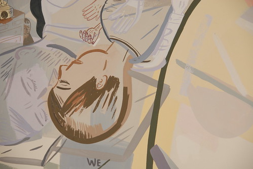
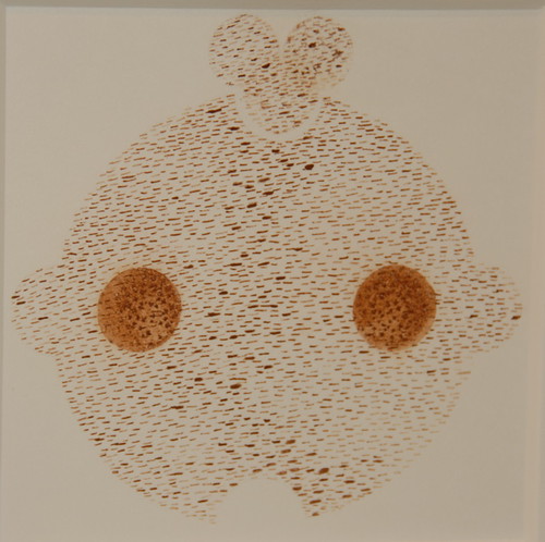
close calls

fecal face posted my art blog on the close calls 2007 show
DSC_0014.jpg
DSC_0029.jpg
DSC_0043.jpg
@ headlands center for the arts
featuring: Mari Andrews, Johnna K. Arnold, Todd Barricklow, Lisa K. Blatt, Jon Brumit, Freddy Chandra, Alexander Cheves, Lisa Conrad, Lauren Davies, Chris Duncan, Sheila Ghidini, Diana Guerrero, Karen Hampton, Jason Jagel, David O. Johnson, Hiroyo Kaneko, Steve Lambert, Vanessa Marsh, Victoria May, Gretchen Mentzer, Michael Meyers, SungHong Min, Lucas Murgida, Anne Faith Nicholls, Sean Olson, Trevor Paglen, Kathleen Quillian & Gilbert Guerrero, Nadim Roberto Sabella, Zachary Royer Scholz, Lisa Stoneman, Dan Tierney.
jan. 14-feb. 25, 2007

check out the blog or my slideshow

Ironic Iconic


'Remod Icons'

The first ever graphic design gig I got was in High School. My dad worked for the school district and got me a job designing the icons for an emergency manual. I remember being fascinated at trying to create a simplified graphic that represented larger complex issues.

Fast forward 20 years and icon design makes up a large portion of the work I do. The style I choose matches what the project demands and dove tails with their current branding. The icons shown here were for a remodeling company to use on their web site, downloadable documents and print material.

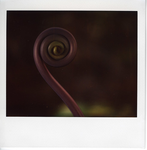
life sized polaroids (hawaii)

07jan14d (vnp).jpg
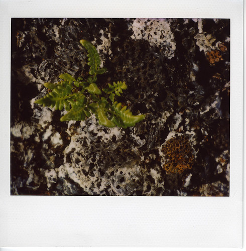
uluhe fern shoot, volcano national park, hawaii.

07jan10c (akaka falls).jpg

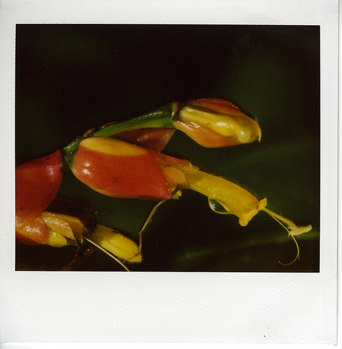
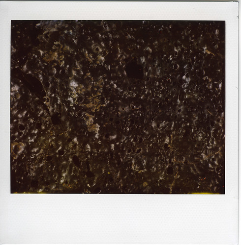
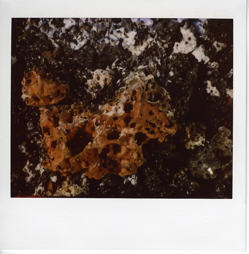
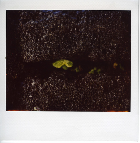
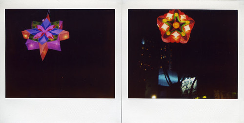
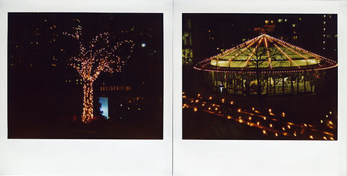
i took a series of polaroid samples on my recent trip to hawaii. the image on the polaroid is the same size as the item photographed (so that if i want to photograph something bigger than a polaroid, i have to create a polaroid construction).

the series includes polaroids taken on the caldera floor of kilauea volcano, which is an active volcano.
07jan14i (vnp kilauea caldera floor).jpg
07jan14m (vnp kilauea caldera floor).jpg
07jan14k (vnp kilauea caldera floor).jpg
i am finding myself more compelled by the life-sized photos -- which do a better job at showing, for example, the plant life making inroads on the caldera floor. it also seems somehow truer to me.
07jan14l (vnp kilauea caldera floor).jpg

view the full 41 photo slideshow.

art blogging

fecal face posted my art blogs on three shows earlier this month.

1. anne faith nicholls' solo show
DSC_0307.jpg
@ shooting gallery
dec. 2, 2006 - jan. 6, 2007

see the blog or my slideshow

2. the anniversary show @ aftermodern
DSC_0288.jpg
featuring work by ben woodward (inclunding above) and berdardo poggi leigh, tahiti pehrson, ann toebbe, aarow white, jordan isip, becky suss, others (see gallery web site)
nov. 27, 2006 - jan. 27, 2007
see the blog or my slideshow

3. james drake's solo show
DSC_0303.jpg
@ gallery paule anglim
jan. 3-27, 2007
see the blog or my slideshow

Analog & Digital


'Cross Fertilizing Ideas' - Click to View Larger Image.

I've been illustrating for a publication called 'Gas & Oil Investor' for about seven years now. I get the articles sent to me and then wade through a massive amount of information I frankly don't have a clue about and try to isolate something I can then play off of conceptually. This time around is was the wording in the article that said 'Cross Fertilization of Shared Ideas'. That put an image in my mind and I jumped on it.

For this project I wanted to use some of the textures that will be part of my texture book due out in June. I also wanted to to handle this project a in a little different method style wise as well so I illustrated the core artwork manually with a pen and paper then scanned it in and started painting in textures and detailing etc.


'Detail on Textures' - Click to View Larger Image.

As you can see from the detail shots above you can create a very rich texture effect by layering multiple textures and playing around with layer effects in Photoshop.

I'll be posting a tutorial on this artwork at IllustrationClass.com soon and that will include a layered PSD file so you can wade through it and see how I set it all up.

Not all SPEC work is bad.


'Specs-O-Plenty'

A while back I followed a link from 'Boing Boing' that took me to a blog post called 'Eyeglasses Stores are for Suckers'. After reading that post I had to agree with the guy. The last time I purchased glasses (Lens, Frames and coating etc.) it came to about $500.

In the article the guy talks about many online vendors that now sell eyeglasses. You don't have to buy them from the specialized eye clinics that mark them up like a movie house does it's pop corn. You see it's all about the numbers. The doctor gives you a prescription card with the exact numbers a Binyon's would need to make your lenses. I realized my doctor forgot to write one bit of information on my card. The pupillary distance was not on it, so I called up the clinic and reqested the number. I knew they had measured me.

When the doctor called me back and found out I was buying my glasses online he kind of freaked. Insisted that it was a bad idea but when I asked him if the numbers on the card were accurate he said "Of course they are." which then begged the question "So all they have to do is follow the numbers right?" The doctor still insisted it was a bad idea all though he couldn't tell me why exactly? They eventually gave me the PD number I needed.

Today I started researching the various vendors listed at the linked site. I settled on 'www.39dollarglasses.com'. No the name isn't very clever but the site is nice and easy to use. The total cost for 'Frames, High Density Lenses, AR Coating etc.' is a grand total of $154 plus FREE Shipping. (Because my eyes are so bad I had to pay an extra $29 for specialized shaping so you could get them for around $115) Sure if you go to Binyons and look through their cheap area you'll find prices close to that but anything that looks cool is jacked up bigtime. Compared to what I paid last time I am saving over $300.

My only problem now is figuring out what style to go with. So I took the full-size sample images off the web site and mocked up my melon with some specs. (No making fun of my fat head either)

Let me know what specs you think I should get?

sg 2006 from sf (soma)

sg06four.jpg
sg06three.jpg
yerba buena.

sg06one.jpg
sg06two.jpg
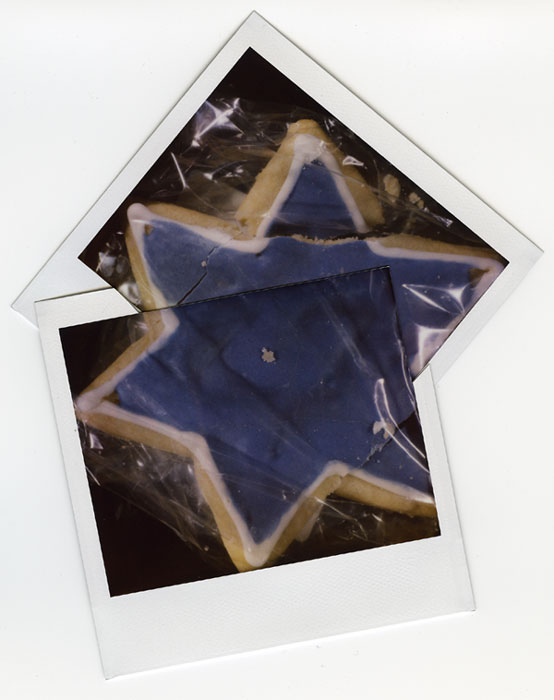
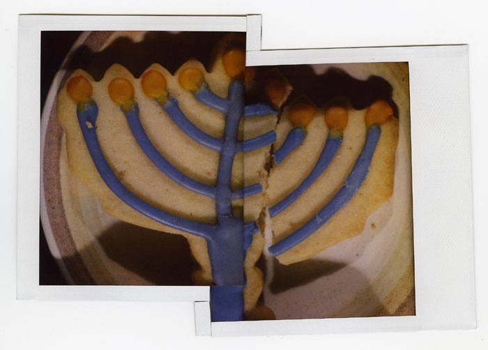
cookies, polaroid sample (life sized), first night of hanukkah chanukah hanukah chanukkah.

sg06five.jpg
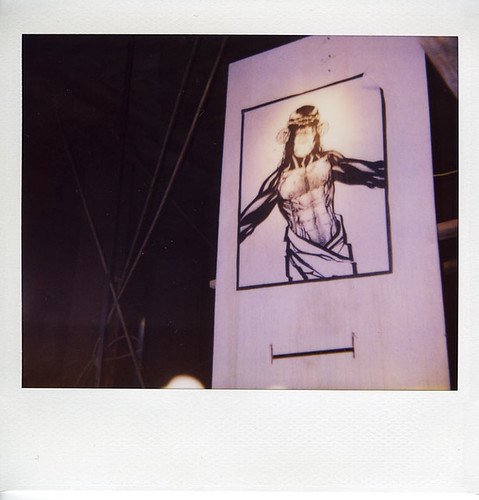
nate's chimp jesus. 4th street, under the freeway (near harrison). polaroid fails to show face details. i tried a few things, this is the best i got.

sg06six.jpg
fifth night of chanuka hanuka chanukkah hanukka channukah. fifth night of khanike. i just learned a variety of more and less common spellings.

sg06seven.jpg
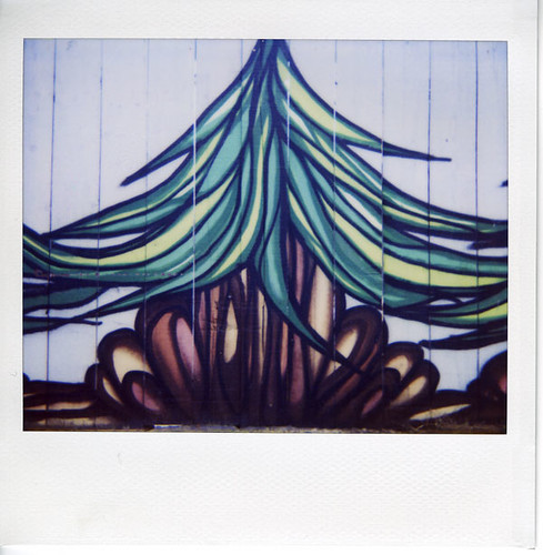
plantrees. shipley@6th.

Texture Exploring


'Dead Ideas' Playing with Textures - Click to View Larger Image.

In June my texture book will be released and I wanted to start creating some sample images of how you can use the textures that come with the book in your artwork. Of course the book itself is filled with a ton of great art by over 50 artists using the textures already but I decided to play around with them myself again today.

As you can see from the detail shots above you can create very rich depth of organic flair by experimenting in Photoshop. All the textures used in this are were derived from digital photos I took of found surface textures. A few were created the old fashion way using some tempura paint and old cardboard then scanning it in.

I'll be posting a tutorial on this artwork at IllustrationClass.com soon and that will include a layered PSD file so you can wade through it and see how I set layer effects and such.

Partum Professio = Create Art


'Insolitus' Collage Illustrative Design - Click to View Larger Image.

Since doing my Swat design I've wanted to experiment more with this whole collage method for design. Actually a better description for this whole style is 'Compost Modernism'. (Thank you Scott Hull for that name.)

When I started brainstorming an idea this image instantly formed in my mind. The process was all about experimenting. I'd try something and it didn't work well so I'd try something else. Originally I had a gas mask instead of a skull and it looked cool but like I've said before a skull is one of the top ten themes artists like so I had to go that route.

I decided to work text into this but didn't want it to distract from the overall feel so I used a dead language, Latin. This allows me to get nice type all the while making it more of a graphic element then informational. That said they do translate to what I was after.


Detail of Design.

It's hard to appreciate the subtle textures and overlapping that makes this style appealing so this image shows a more detailed shot of how the images relate. I designed this as a t-shirt design so it needed to be silk screenable.