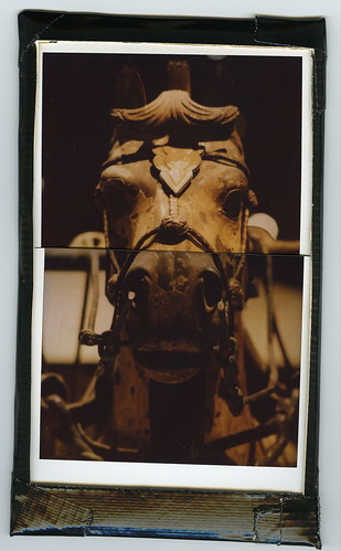
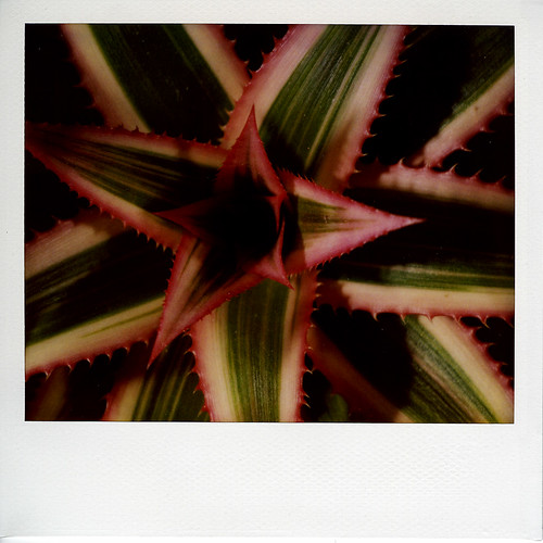
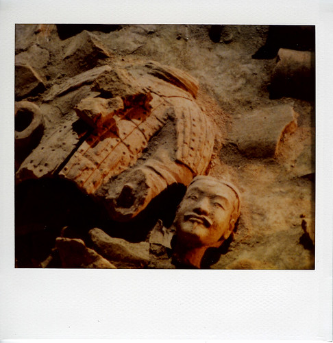
"frice," david choe's solo show at
anno domini, in downtown san jose, opened last friday night.
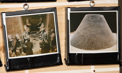
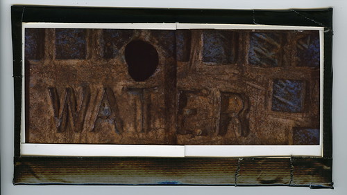
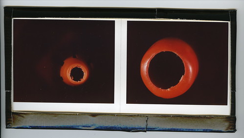
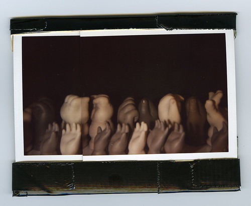
the show includes
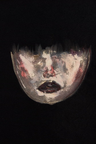
--this work on black velvet, which choe uses to complete the image
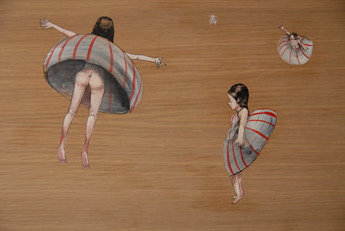
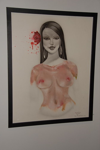
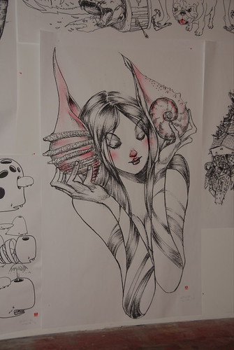
--this sweet detailed illustration
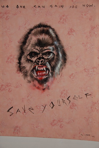
choe is a bit pervy.
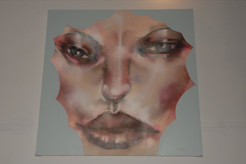
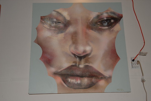
--this collaboration with mr. cartoon (air brush and oil paint on paper), which is both amazing and too pin up girl for me.
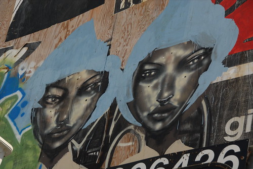
--his twins
these ladies may be familiar. choe painted them on one of the doors next to 5024 on fillmore in sf's lower haight.
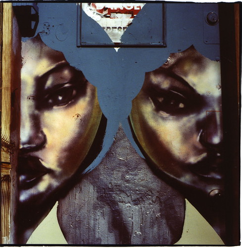
before that, he painted them next to, and above, gr2 in la (still up in sept. 06)
the show also includes photocopy enlargements, one-offs, 1000% sized images from his sketch book.
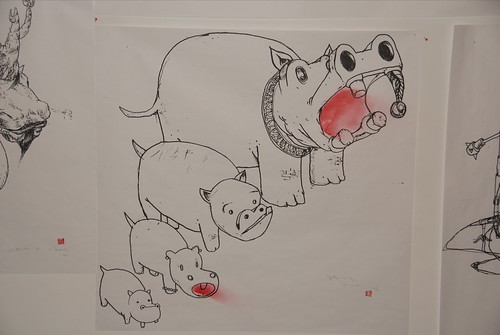
these were huge (as big as 7feetx3feet); many had additional hand shading; priced between $40 and $150. looks to me like his gift of opportunity for local fans. mostly sold at the opening (i think), but not all.
they gave him the whole gallery. this was mostly good.
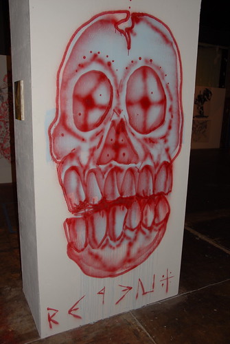
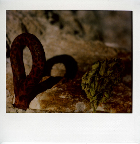
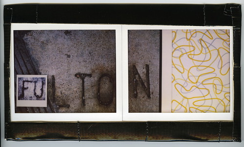
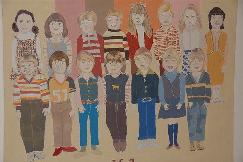
and somewhat random
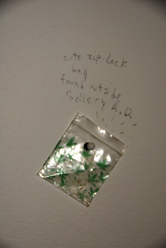
my photo
set and
slideshow have more photos of the work. unfortunately, my flash didn't agree with all of the work.
gallery ad also posted the show, with prices,
here. i think david choe is really talented. somewhat volatile. somewhat juvenile. there is a good chance that he will have an interesting career. right now, he can, and likely does, support himself doing graphic design work. his also makes t-shirts and participates in some corporate art programs. i hope this doesn't kill his gallery work. in any event, this is a good show for choe's work. he has a solo show at jonathan levine in january 2007.
check out the show - which runs through nov. 25, 2006 - in person.
anno domini366 so. first street, san jose, ca